Intro
We’re going to build a simple application that fetches cards with images asynchronously into an Angular app from a Node.js Express server and only loads more after the user has scrolled to the bottom of the page.

End result
Prerequisites:
- HTML, CSS, JavaScript
- Familiarity with Angular or any other JavaScript framework
- Basic understanding of HTTP requests
- Basic knowledge of Node.js
What is lazy loading?
Lazy or on-demand loading is simply a way to load content into a website only after the user has requested to see it.
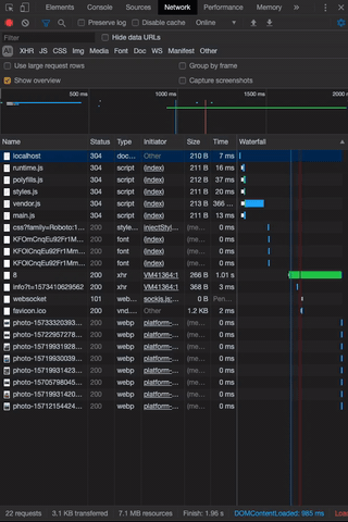
Chrome’s network tab when scrolling through the page
In the example above you can see that additional cards are only loaded only after the user starts scrolling.
Why use lazy loading?
By loading images and videos only when they’re needed we can dramatically speed up web apps. This will ultimately offer better user experience especially for users running the app on a mobile data plan.
Getting started
We’re going to start by making a folder in your project directory. Open your terminal and type:
mkdir server As you’ve probably guessed our express server will run in the server folder while our angular app will be built in the client folder which will be later generated by the CLI.
Working on the server
In your server folder run the following to create an empty package.json file:
npm init -yYou’ll need Express for the server:
npm i expressAnd Nodemon for auto-reload after you make a change in your code:
npm i nodemon -DOpen package.json in your favourite code editor and add the following scripts:
"scripts": {
  "start": "node server",
  "dev": "nodemon server"
},
Create a new file called server.js and paste the following code in:
const express = require('express');

const app = express();

//set headers
app.use(function (req, res, next) {
    res.header('Access-Control-Allow-Origin', '*');
    res.header(
        'Access-Control-Allow-Headers',
        'Origin, X-Requested-With, Content-Type, Accept'
    );
    next();
});

// items API Routes
app.use('/api/items', require('./routes/api/items'));

const PORT = process.env.PORT || 5000;

app.listen(PORT, () => console.log(`Server started on port ${PORT}`));
Our server code
Server.js serves items.js file on /api/items route which doesn’t exist yet, so let’s create it along with needed folders and mock data file.
Create the following directories and files:
/server
  server.js
  /data
    items_list.js
  /routes
    /api
      items.js
Grab some mock data for your items_list.js:
Create a simple API endpoint with pagination function in items.js:
const express = require('express');
const router = express.Router();
const items = require('../../data/item_list');

// Get All items
router.get('/', (req, res) => res.json(items));

// Paginate Items
router.get('/page/:page_number/amount/:page_amount', (req, res) => {
  const page = parseInt(req.params.page_number) - 1;
  const pageAmount = parseInt(req.params.page_amount);
  const found = items.slice(page * pageAmount, (page + 1) * pageAmount);

  if (found) {
    setTimeout(() => {
      res.json(found);
    }, 1000)
  } else {
    res.status(400).json({ msg: `No items with the specified parameters` });
  }
});

module.exports = router;
items.js
Note: since our server is running locally, responses will be almost instant. To simulate a live server that will be a lot slower, a 1-second timeout is added before the endpoint is sending the response back.
Awesome! We can get our server up and running by typing the following inside /server folder:
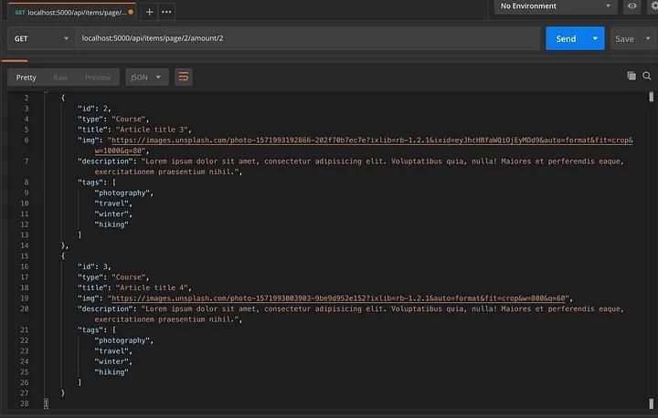
npm run devOpen the Postman app and make a test GET request to your endpoint from items.js.
Articles 3 and 4 are getting returned as we passed page/2 and amount/2 as parameters for the API endpoint.
Working on client
Now that we have our server running and serving some mock data for our app, we can start working on the front-facing part of the project using Angular.
Generating boilerplate
Make sure you have Angular CLI installed to generate the boilerplate code for the client:
ng new clientChoose SCSS as your style preprocessor.
We’ll need an Angular service and some components for our app, so let’s use the CLI to generate them while we’re at it.
Inside /client, generate a service that will talk to the back end API we made earlier:
ng g s apiAnd of course, the UI components that we’ll use for the layout and styling of the app:
ng g c grid && ng g c card && ng g c card-shimmerNext, you’ll need to create an interface to type check your front end code. Create a file named item.interface.ts and add the following code:
export default class ItemInterface {

  id: number;
  title: string;
  type: string;
  img: string;
  imgLarge: string;
  description: string;
  text: string;
  tags: string[];

  constructor(id: number, title: string, type: string, img: string, imgLarge: string, description: string, text: string, tags: string[]) {

    this.id = id;
    this.title = title;
    this.type = type;
    this.img = img;
    this.imgLarge = imgLarge;
    this.description = description;
    this.text = text;
    this.tags = tags;
  }
}
item.interface.ts
The last 2 files we’ll need are for styling. Create _typography.scss and _animations.scss.
@import url('https://fonts.googleapis.com/css?family=Roboto:100,100i,300,300i,400,400i,500,500i,700,700i,900,900i');

body {
  margin: 0;
  font-family: 'Roboto', sans-serif;
}

a {
  text-decoration: none;
}
_typography.scss
.spinner-container {
  display: flex;
  margin-top: 50px;
}

.spinner {
  width: 2.5rem;
  height: 2.5rem;
  border-top-color: #4285f4;
  border-left-color: #4285f4;

  animation: spinner 400ms linear infinite;
  border-bottom-color: transparent;
  border-right-color: transparent;
  border-style: solid;
  border-width: 2px;
  border-radius: 50%;
  margin: auto;
}

@keyframes spinner {
  0% { transform: rotate(0deg); }
  100% { transform: rotate(360deg); }
}

.shine {
  $shine-opacity: 5%;
  background: darken(#f6f7f8, $shine-opacity)  linear-gradient(
      to right,
      darken(#f6f7f8, $shine-opacity) 0%,
      darken(#edeef1, $shine-opacity) 20%,
      darken(#f6f7f8, $shine-opacity) 40%,
      darken(#f6f7f8, $shine-opacity) 100%
  ) no-repeat;
  background-size: 800px 400px;
  display: inline-block;
  position: relative;

  animation-duration: 1s;
  animation-fill-mode: forwards;
  animation-iteration-count: infinite;
  animation-name: placeholder-shimmer;
  animation-timing-function: linear;
}

@keyframes placeholder-shimmer {
  0% {
    background-position: -468px 0;
  }
  100% {
    background-position: 468px 0;
  }
}
_animations.scss
After creating .scss files, make sure to import them to styles.scss.
Finally, we need to organize our front end app a bit. Organize the boilerplate you just generated into the following structure:
/client/src/app/
  /components
    /containers
      /grid
    /presentationals
      /card
      /card-shimmer
  /services
    api.service.ts
    api.service.spec.ts
  /interfaces
    item.interface.ts
  /style
    _animations.scss
    _typography.scss
Implementing front end functionality
Now that the boilerplate code for the Angular app is generated, we can start connecting it to the Express API that serves paginated items on:
http://localhost:5000/api/items/page/1/amount/12Add the following code to api.service.ts:
import { Injectable } from '@angular/core';

import { HttpClient } from '@angular/common/http';

import { Observable } from 'rxjs';

import ItemInterface from '../interfaces/item.interface';

@Injectable({
  providedIn: 'root'
})

export class ApiService {

  private pageNr = 1;

  constructor(private http: HttpClient) { }

  fetchItems(): Observable<ItemInterface[]> {
    return this.http.get<ItemInterface[]>(`http://localhost:5000/api/items/page/${this.pageNr}/amount/8`);
  }

  paginatePage(): void {
    this.pageNr ++;
  }
}
api.service.ts
fetchItems() method returns an observable with a type of ItemInterface[]. We’ll be able to subscribe to the values this method receives from the server.
paginatePage() simply increments page number for the API request URL so that each time it’s called, we could get new items from the server and show them to the user as the page is scrolled.
We now have data in our Angular app, but to show it to the user, we need to connect to the Angular API service and pass received values to the presentational components.
Add this code to the grid component:
import { Component, OnInit } from '@angular/core';
import { ApiService } from '../../../services/api.service';

import ItemInterface from '../../../interfaces/item.interface';

@Component({
  selector: 'app-grid',
  templateUrl: './grid.component.html',
  styleUrls: ['./grid.component.scss']
})
export class GridComponent implements OnInit {

  constructor(private apiService: ApiService) {}

  cards: ItemInterface[] = [];
  isLoading = false;
  loadedAll = false;
  isFirstLoad = true;

  ngOnInit(): void {

    this.getCards();
    this.handleScroll();
  }

  getCards(): void {

    this.isLoading = true;
    this.apiService.fetchItems().subscribe(res => {
        if (res.length) {
          this.cards.push(...res);
        } else {
          this.loadedAll = true;
        }
        this.isLoading = false;
        this.isFirstLoad = false;
    });
  }

  handleScroll(): void {

    window.onscroll = () => this.detectBottom();
  }

  detectBottom(): void {

      if ((window.innerHeight + window.scrollY) >= document.body.offsetHeight) {
        if (!this.loadedAll) {
          this.apiService.paginatePage();
          this.getCards();
        }
      }
  }
}
grid.component.ts
Inside this component, we’ll check if the user has scrolled to the bottom of the page and if so, fetch more values from the API.
Note: make sure to add HttpClientModule to imports and ApiService to providers inside app.module.ts
Inside grid.component.html add the following layout:
<div class="grid" *ngIf="isFirstLoad">
  <app-card-shimmer *ngFor="let cardShimmer of [0, 1, 2, 3, 4, 5, 6, 7]"></app-card-shimmer>
</div>

<ng-container *ngIf="!isFirstLoad">
  <div class="grid">
    <app-card
      *ngFor="let card of cards"
      [type]="card.type"
      [title]="card.title"
      [img]="card.img"
      [description]="card.description"
      [tags]="card.tags">
    </app-card>
  </div>
  <div *ngIf="isLoading" class="spinner-container">
    <span class="spinner"></span>
  </div>
</ng-container>
grid.component.html
Make a simple responsive grid using CSS grid:
.grid {
  display: grid;
  @media (min-width: 768px) {
    grid-template-columns: 1fr 1fr;
  }
  @media (min-width: 1024px) {
    grid-template-columns: 1fr 1fr 1fr 1fr;
  }
  grid-gap: 20px;
}
grid.component.scss
Card component needs to receive values passed from the grid component, so let’s pass them via Angular “@Input” decorator:
import {Component, Input, OnInit} from '@angular/core';

@Component({
  selector: 'app-card',
  templateUrl: './card.component.html',
  styleUrls: ['./card.component.scss']
})
export class CardComponent implements OnInit {

  constructor() { }

  @Input() type: string;
  @Input() title: string;
  @Input() img: string;
  @Input() description: string;
  @Input() tags: string[];

  ngOnInit() {
  }

}
card.component.ts
<a href='#' class="card">
  <img src="{{img}}" alt="" class="card__img">
  <div class="card__content">
    <div class="card__type">
      {{type}}
    </div>
    <div class="card__title">
      {{title}}
    </div>
    <div class="card__description">
      {{description}}
    </div>
  </div>
</a>
card.component.html
.card{
  $hover-transition: .4s;
  box-shadow: 0 3px 6px rgba(0, 0, 0, 0.16), 0 3px 6px rgba(0, 0, 0, 0.23);
  transition: $hover-transition;
  display: block;
  position: relative;
  &__img {
    width: 100%;
    height: 140px;
    object-fit: cover;
    object-position: center;
  }
  &__content {
    padding: 29px 35px 35px;
  }
  &__type {
    font-size: 12px;
    letter-spacing: 0.3px;
    color: #9aa0a6;
    font-weight: 700;
    text-transform: uppercase;
  }
  &__title {
    margin-top: 10px;
    color: #3c4043;
    font-size: 18px;
    font-weight: 500;
    letter-spacing: normal;
    line-height: 26px;
    transition: $hover-transition;
  }
  &__description {
    margin-top: 15px;
    padding-bottom: 20px;
    color: #5f6368;
    font-size: 14px;
    letter-spacing: normal;
    line-height: 22px;
  }
  &:hover, &:focus {
    transition: $hover-transition;
    box-shadow: 0 10px 20px rgba(0, 0, 0, 0.19), 0 6px 6px rgba(0, 0, 0, 0.23);
    .card__title {
      transition: $hover-transition;
      color: #4285f4;
    }
  }
}
card.component.scss
Cool! Let’s add some styling to the shimmer cards so we could see them instead of a blank screen before the content loads initially:
<div class="article-card-shimmer">
  <div class="shimmer shine article-card-shimmer__img"></div>
  <div class="article-card-shimmer__text">
    <div class="shimmer shine article-card-shimmer__category"></div>
    <div class="shimmer shine article-card-shimmer__title"></div>
    <div class="shimmer shine article-card-shimmer__details"></div>
  </div>
</div>
card-shimmer.component.html
.article-card-shimmer {
  &__img {
    width: 100%;
    height: 140px;
  }
  &__text {
    margin: 0 35px;
    margin-top: 30px;
    display: flex;
    flex-flow: column nowrap;
  }
  &__category {
    width: 30%;
    height: 12px;
  }
  &__title {
    width: 60%;
    height: 18px;
    margin-top: 15px;
  }
  &__details {
    margin-top: 30px;
    width: 90%;
    height: 100px;
  }
}
card-shimmer.component.scss
<div class="container">
  <app-grid></app-grid>
</div>
app.component.html
.container {
  max-width: 1200px;
  padding: 0 25px 50px;
  margin: 50px auto 0;
}
app.component.scss
Yaaay! Your new shiny (literally) lazy loading app is finished. Make sure you’re still running the server and run the following inside /client to start the Angular app:
ng serve -oThe end result should look like this
Thank you for reading and happy coding!
Resources & further reading:
- GitHub link for the completed project
- Angular docs
- Rxjs docs